35: Core PCE, Guide to the Markets
Welcome to Sunday Edition, where I cover the markets, economy, and uncover hidden gems across the internet. This week I'm covering JP Morgans "Guide to the Economy."
Summary
The markets absolutely ripped this last, with The Index up 2.6% and the Nasdaq up 3.9%.
Core PCE rate of decrease is slowing, showing that rates may stay higher for longer, further weighing the economy.
JP Morgan published their Guide to the Markets, and excellent source for economic snapshot. (link and charts below)
Table of contents
What's New
I am very close to finalizing my DCF template, at which point I will start modeling all the companies I'm interested in. I have no doubt that there will be errors in the model, but getting the model as put-together as I can then publishing is key for long-term improvement.
I'm learning about Fastenal. If you have any questions you'd like to know about the company please email me.
Quote of the week
Two quote this week. I saw them both and had to include them.
I do what is mine to do; the rest doesn’t disturb me.
The things you think about determine the quality of your mind. Your soul takes on the color of your thoughts.
Marcus Aurelius, Meditations
Some of you have asked how I get my quotes. I'm a lover of Kindle and Readwise. They are a match made in heaven. A long time ago, when Readwise was relatively new, I was lucky enough to get into their lifetime plan. It's paid for itself many times over.
I am not affiliated with Readwise (or anyone else). You can check out readwise here: Readwise
Markets
The markets had quite a rip this last week. The S&P 500 is up 2.6% while the Nasdaq is up 3.9%:
Still, the index is not where it topped out earlier this month:
After such a high return last year, I'm halfway expecting a low return this year, but nobody knows.
Subscribe
Get posts just like this one sent to your inbox when they're published:
SUBSCRIBE!
Check your inbox to confirm your subscription. Thank you!
Economy
Core PCE came out (one of the preferred metrics by the FOMC for setting rates). It's still ticking lower, but the rate of decrease is slowing quite a bit. This spells a higher rate for longer, further straining the economy while fighting inflation.
Sectors
Information technology and consumer discretionary took the cake this week with 3.6 and 5.0 percent return respectively. Information technology is still very much in the lead on a five year basis at 18.8% CAGR:
Internet Gems
JP Morgan recently released their quarterly "Guide To The Markets." You can check it out here: mi-guide-to-the-markets-us.pdf (jpmorgan.com)
Markets
This first chart is wild. The top ten stocks in the S&P 500, as of March 31, make up 33.5%. Notice how this is much higher than the 2000 dot com bubble:
But here is where a lot of investors get themselves mixed up: just because the biggest 10 companies in the Index make up a significant portion of the Index doesn't mean we are in a bubble. The 2000 dot com bubble and subsequent burst has scarred a lot of investors (and rightfully so), but we need to have the mental agility to be able to see what is going on right now. This doesn't mean "this time it's different" (the worst 4 words in investing), but looking at each company's valuation.
Similarly, the Magnificent 7 have done quite well.
Notice how the last three charts have all said relatively the same thing: big growth/tech have crushed the competition (so far).
Federal Budget
This next chart shows the federal budget. It's nice to see where the money is going:
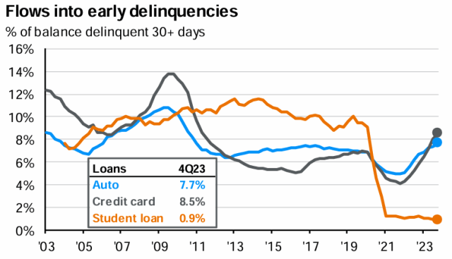
Flows into early delinquencies shows how the average debt holder in the United States is fairing with the economy. We can see where student loans became a much smaller issue, and where, recently, auto and credit card loans became more of an issue. Credit card peaked at roughly 13.9% in the great financial crisis following 2008, and right now we're at 8.5% and climbing. Is it a big thing to worry about? Who knows! Nobody knows the future, but it pays to pay attention long term. That is, as long as we don't let it consume our lives (which it easily can). Watch, take note, move on to learning about the world, investing, and building.
This last chart drives the point home: while a 60/40 portfolio offers diminished volatility, it also offers less average long-term return than stocks.
The lesson I derive from this chart, and you should too, is that investing is a long-term practice. As a very wise man once said, it's about time in market, not timing the market.
Portfolio
The portfolio took quite a lick this year compared to the benchmark.
QTD % YTD % 1 Year % Since Inception Annualized S&P 500* -2.9 7.4 25.3 20.0 9.9 Portfolio -4.1 3.1 28.5 43.0 21.2
Performance data is indicative and should not be considered as advice. *S&P500 includes dividends reinvested. Inception date: 2022-04-18.
Below is my current portfolio sorted by weight:
Subscribe to Walsh Investment Strategy to unlock.
Become a paying member of Walsh Investment Strategy to gain access.
A membership gets you:
✓ Premium Research
✓ Sunday Edition Email
✓ Real-Time Portfolio Updates
✓ Community Access
✓ Inner Circle
The post 35: Core PCE, Guide to the Markets appeared first on Walsh Investment Strategy.


